June 26, 2026 More Than a Logo: The Meaning Behind iCare’s Identity
A logo is often the first thing people notice about an organization. In healthcare, however, it can mean much more than recognition. It can represent values, purpose, and a promise that people hope will be fulfilled when they need care the most.
Whether it appears on a membership card, a mobile application, a hospital directory, or a clinic sign, a healthcare logo becomes part of moments that matter. It accompanies people when they seek treatment, schedule a consultation, or support a loved one through illness. In those moments, trust matters as much as visibility.
That is the thinking behind iCare’s identity. More than a visual mark, the logo was designed to reflect the company’s purpose and the principles that guide how it serves members, employers, healthcare providers, and communities.
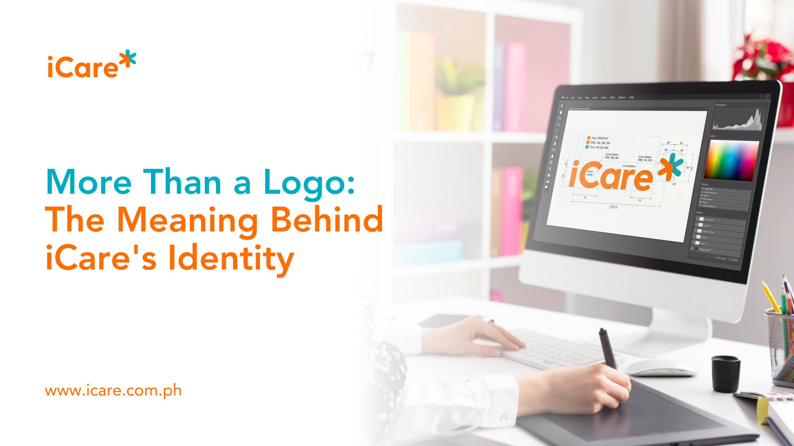
At the center of the logo’s meaning is the iCare Star, a distinctive symbol inspired by the internationally recognized Star of Life. According to the iCare Brand Manual, it reflects the company’s commitment to healthcare while serving as the visual focal point of the brand’s identity. Alongside it, the bold letter “C” stands for Care, reminding both employees and members that compassion should remain at the heart of every interaction. Completing the design are two converging arrows that symbolize the meeting of innovation and care, expressing the belief that meaningful healthcare is achieved when new ideas are guided by genuine concern for people.
The colors reinforce that same meaning.
Healthcare organizations have traditionally relied on blue and green because these colors are commonly associated with trust, safety, and healing. iCare deliberately chose orange to express something different. The Brand Manual explains that orange represents vitality, warmth, optimism, and a fresh perspective on healthcare. Inspired by the orange fruit, long associated with health and nourishment, the color reflects the company’s aspiration to make healthcare feel more approachable and hopeful. Teal provides balance by conveying trust, calmness, and professionalism, bringing together warmth and confidence in a single identity.
The meaning behind the logo also reflects how healthcare itself has evolved.
Today, good healthcare is no longer measured solely by the treatment people receive after they become ill. Increasingly, it is about helping people stay healthy through preventive care, early intervention, better access to healthcare professionals, and more personalized support throughout their health journey. Employers likewise recognize that investing in employee health contributes to productivity, resilience, and workplace wellbeing. Around the world, healthcare organizations are becoming long-term partners in healthier living rather than simply providers of medical care.
That broader perspective is reflected in iCare’s mission to enable Filipinos to say yes to better health. The company’s brand values of innovation, care for customers, accessibility, reliability, and excellence reinforce the belief that quality healthcare should be compassionate, accessible, and continuously improving.
Ultimately, the meaning behind an identity is defined not by its design but by the experiences it represents.
People are cared for by physicians, nurses, healthcare professionals, customer service teams, and countless individuals working behind the scenes. A logo simply serves as a reminder of the responsibility an organization accepts every time someone places their trust in it.
For iCare, that responsibility is expressed in five simple words that appear beneath its identity: “Say Yes to Better Health.”
More than a tagline, it is an aspiration to help more Filipinos live healthier lives. Every time the iCare logo is seen, whether on a membership card, a hospital directory, a clinic sign, or a digital screen, it serves as a reminder that behind every symbol is a promise: to innovate with purpose, to care with compassion, and to help every Filipino say yes to better health.
Sources and References
iCare Brand Manual (2025). Mission, vision, logo symbolism, brand values, color palette, tagline, and brand guidelines.
World Health Organization. Integrated People-Centred Health Services. https://www.who.int/teams/integrated-health-services